Animated Middle East Crisis Map
 In an earlier post, I mentioned that the BBC had a series of static maps that show the day-to-day details of this crisis. One of their competitors, The Guardian, has improved on this idea by creating a Flash-driven time-series map of the conflict.
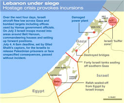
Helpful hint: To begin the animation, you must click on the tiny arrow beside the word "Next"-- Why couldn't they have made it easier on the user by making a larger hot spot?
posted by Dennis Ward on Thursday, July 20, 2006
![]()


<< Home